Data Visualizations with a Side of Storytelling

The Opioid Crisis
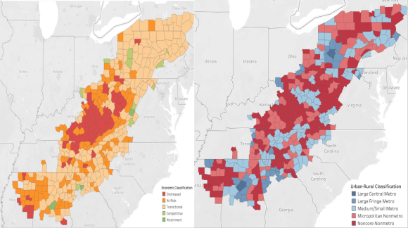
Special Focus on the Appalachian Region
My interest in the Opioid Crisis began when I stumbled upon opioid data during a data visualization course in college. The more I dug, the more I wanted to explore all aspects of the crisis and the contributing factors. I ultimately wrote my honors thesis on this, doing an exploratory data analysis to answer the question: What were the primary driving factors behind the opioid epidemic in the United States?
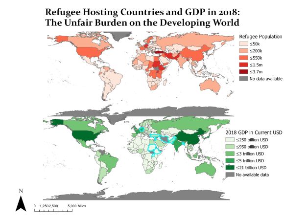
Refugee Hosting Countries vs GDP
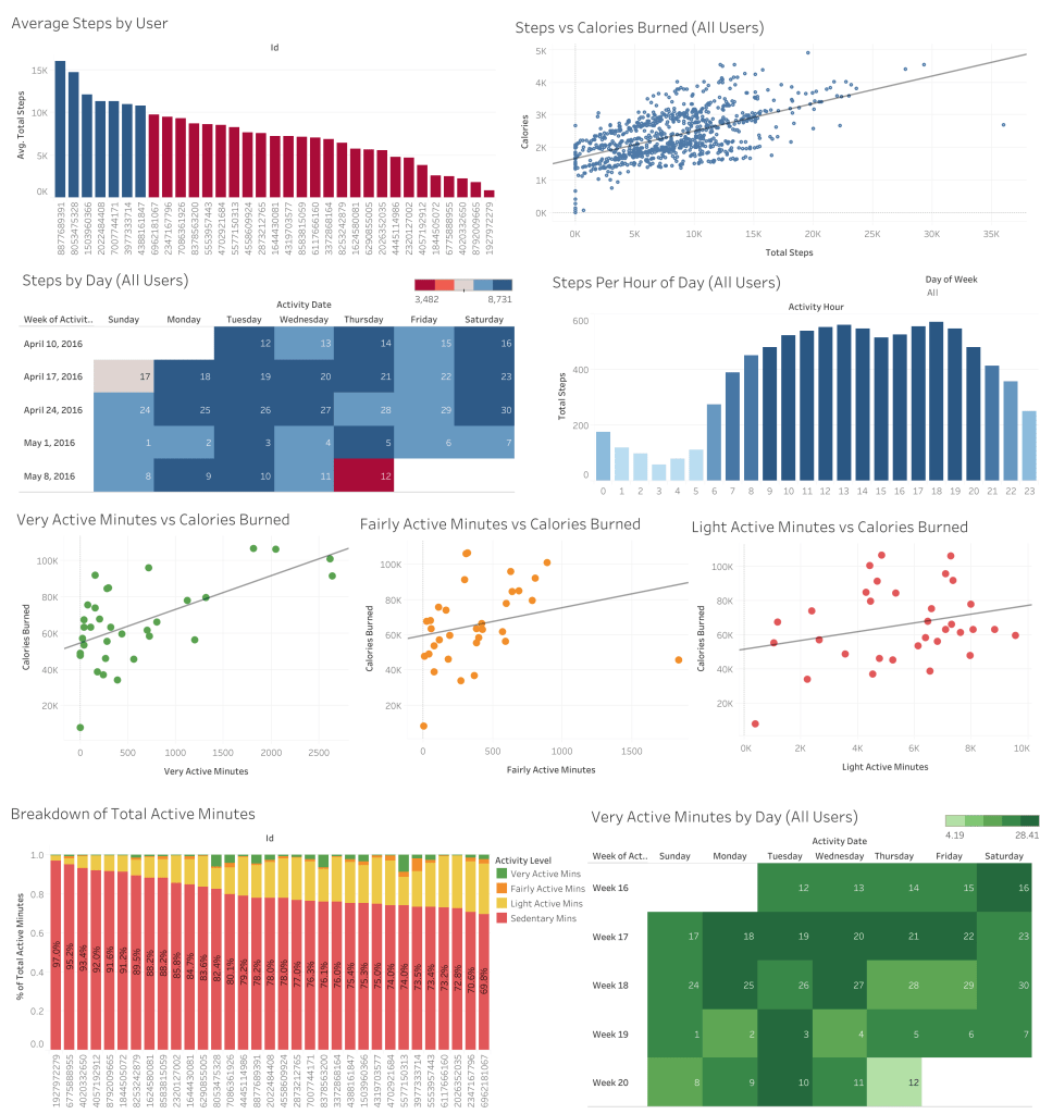
Bellabeat Case Study
“Numbers have an important story to tell. They rely on you to give them a clear and convincing voice.”
– Stephen Few
Pill Map Graphic: https://www.aamc.org/news-insights/opioids
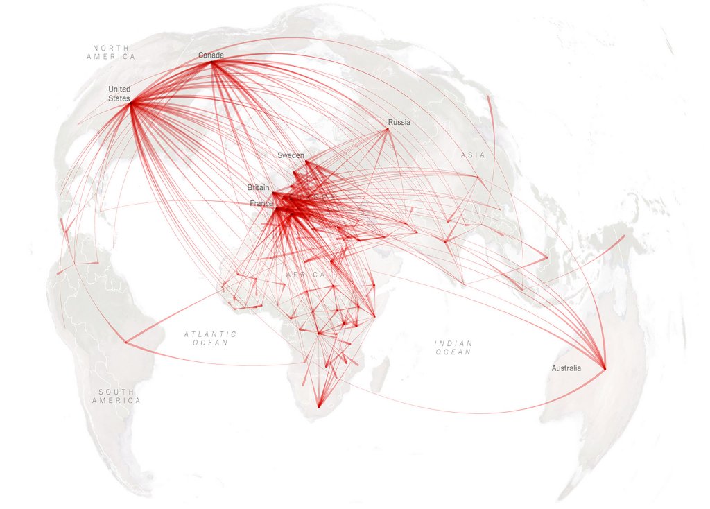
Refugee Map Graphic: https://www.nytimes.com/interactive/2015/06/21/world/map-flow-desperate-migration-refugee-crisis.html
